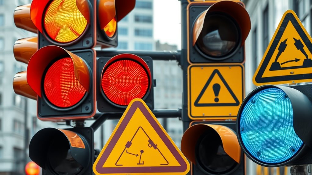
Colors like red and yellow grab your attention fastest because they evoke emotional responses linked to urgency and caution. Red signals danger and triggers alertness, while yellow offers high visibility and contrast, making it easy to recognize quickly. Blue and green are calmer and less attention-grabbing, but their effectiveness depends on contrast, shape, and size. To see how these principles come together to optimize alerts, keep exploring the key factors behind quick recognition.
Key Takeaways
- Red triggers immediate alertness and signals danger, making it highly effective for rapid attention in emergencies.
- Bright yellow offers high visibility and contrast, quickly conveying caution and alertness.
- High-contrast color combinations, especially involving red or yellow, enhance visibility and draw focus instantly.
- Vibrant colors paired with warning shapes (like triangles) evoke urgency and accelerate recognition.
- Cultural associations influence color effectiveness; understanding regional meanings ensures faster attention and correct interpretation.

MOLTRES Waterproof Reflective Tape,Red & Yellow 2inch X 30Feet Conspicuity Adhesive Safety Tape,High Visibility Arrow Hazard Warning Reflector Tapes for Trucks Trailer Vehicle Outdoor Signs
RFLEXIBLE EFLECTION, ULTRA CONSPICUITY High visibility reflective tape uses the most advanced prism technology which has high intensity…
As an affiliate, we earn on qualifying purchases.
As an affiliate, we earn on qualifying purchases.
The Impact of Color on Human Attention

Colors play a crucial role in capturing human attention because our brains respond quickly to visual stimuli. Different colors evoke specific psychological impacts, influencing how we perceive and react to alerts. For example, red often symbolizes urgency and danger, making it highly effective in grabbing attention quickly. Blue, on the other hand, tends to convey trust and calmness, which can influence the message’s tone. Understanding color symbolism helps you choose hues that effectively communicate your intent and trigger the desired response. The psychological impact of colors varies across cultures and individuals, but their ability to attract attention remains consistent. Additionally, the contrast ratio of colors significantly enhances visibility and ensures that alerts stand out more prominently. By leveraging this knowledge, you can design visual alerts that stand out and prompt immediate action.

Industrial Warning Light 3 Color in 1 Layer Red Yellow Green Led Signal Steady Light with Buzzer Rotating Base
Three in one tower warning light , with more advanced technology, can display three different colors with just…
As an affiliate, we earn on qualifying purchases.
As an affiliate, we earn on qualifying purchases.
How Brightness and Saturation Influence Noticeability

Brightness and saturation are key factors that determine how easily a visual alert will stand out and grab attention. Perceived brightness influences how your eyes interpret a color’s intensity, making brighter visuals more noticeable. Saturation effects also play a vital role; highly saturated colors appear more vivid and striking, increasing the alert’s visibility. When an alert has high perceived brightness, it naturally draws your focus faster, especially in cluttered environments. Similarly, increased saturation amplifies the alert’s intensity, making it seem urgent and important. By adjusting these elements, you can enhance noticeability without relying solely on color hue. Effective use of brightness and saturation ensures your alert captures attention quickly, guiding your focus exactly where it needs to go. Additionally, understanding visual processing can help optimize alert design for maximum impact.

Aleplay SDS OSHA Data Labels for Chemical Safety 3×4 Inch MSDS Stickers with GHS Pictograms HMIS & Hazard Compliant Secondary Containers, 100 Stickers Per Roll
Right To Know SDS/MSDS Stickers—These stickers presents a user-friendly label that provides brief guidance to help workers who…
As an affiliate, we earn on qualifying purchases.
As an affiliate, we earn on qualifying purchases.
The Role of Red in Urgency and Warning Signals

Red is universally associated with urgency and warning signals because it instantly triggers a sense of alertness and importance. This color leverages psychological associations that evoke strong emotional responses, making it perfect for alert systems. When you see red, your brain perceives danger or the need for immediate action. Its boldness cuts through distractions, grabbing your attention quickly. To understand its impact, consider this table:
| Signal Type | Psychological Associations | Emotional Responses |
|---|---|---|
| Stop signs | Danger, caution | Anxiety, alertness |
| Fire alarms | Emergency, urgency | Fear, stress |
| Warning labels | Caution, attention | Worry, caution |
| Emergency lights | Immediate action | Panic, focus |
| Prohibition signs | Restriction, warning | Restraint, concern |
Red’s role in warnings taps into deep-seated reactions, ensuring swift recognition. Additionally, the visual prominence of red enhances its effectiveness in capturing attention swiftly.

Safety Warning Signs Stickers for Water Bottles, 70 Pcs Kids Game Vinyl Waterproof Decals for Laptop, Skateboard Scrapbooking Decor for Teens Girls Boys Adults
【PACKAGE CONTENTS】This pack of stickers contains 70 different warning sign designs. Each design is approximately 1-2 inches.
As an affiliate, we earn on qualifying purchases.
As an affiliate, we earn on qualifying purchases.
The Effectiveness of Yellow for Quick Recognition

Yellow stands out because of its high visibility and strong contrast with other colors, making it easy to spot quickly. Its universal association with caution and alertness helps people recognize it instantly across different cultures. This combination enables yellow to be processed rapidly by your brain, ensuring quick recognition in urgent situations. Additionally, research shows that color psychology influences how rapidly our brains respond to visual cues, further enhancing yellow’s effectiveness.
High Visibility and Contrast
Because of its high contrast against most backgrounds, yellow is exceptionally effective for quick recognition in visual alerts. Its brightness captures attention immediately, triggering an emotional response rooted in urgency and alertness. The color symbolism of yellow often signifies caution or warning, making it ideal for safety signs. To visualize, consider this table:
| Bright Sun | Warning Sign | Racing Car |
|---|---|---|
| Yellow Flower | Caution Tape | Traffic Light |
| Lemon Slice | Hazard Symbols | Emergency Exit |
This vivid contrast ensures your message stands out clearly, even from a distance. The sharp differentiation between yellow and surrounding colors enhances visibility, making it indispensable for alerts where fast recognition matters most. Your audience instinctively associates yellow with caution, heightening awareness instantly.
Universal Color Associations
The universal recognition of yellow as a cautionary color stems from its strong psychological associations across cultures. Its color symbolism evokes immediate emotional responses, making it effective for quick recognition. Yellow’s brightness naturally attracts attention, signaling alertness or warning. Its universal use in traffic signals and warning signs underscores its effectiveness in conveying urgency. You’ll notice that yellow often triggers feelings of caution, optimism, or alertness, depending on context. This consistency across cultures helps ensure your message is understood quickly.
- It signals caution or warning in many safety contexts.
- It evokes feelings of energy, warmth, or optimism.
- Its cultural association with alertness enhances rapid recognition.
Rapid Cognitive Processing
The brightness and high visibility of yellow enable it to capture attention instantly, making it highly effective for quick recognition. Neuroscience insights reveal that yellow stimulates the brain’s alertness centers, triggering rapid cognitive processing. Its vivid hue evokes strong emotional responses, such as optimism and urgency, helping you notice critical alerts swiftly. This color’s ability to cut through clutter is essential in environments demanding immediate action. Consider the following emotional impact:
| Positive Emotions | Urgent Reactions |
|---|---|
| Optimism | Alertness |
| Happiness | Attention-Grabbing |
| Hope | Quick Response |
| Clarity | Focus |
| Energy | Immediate Recognition |
Yellow’s quick recognition power stems from its capacity to engage the brain efficiently, ensuring your response is fast and instinctive. Additionally, its effectiveness is supported by its role in visual alert design, where rapid cognitive processing is critical for safety and efficiency.
Blue and Green: When and Why They Are Less Attention-Grabbing
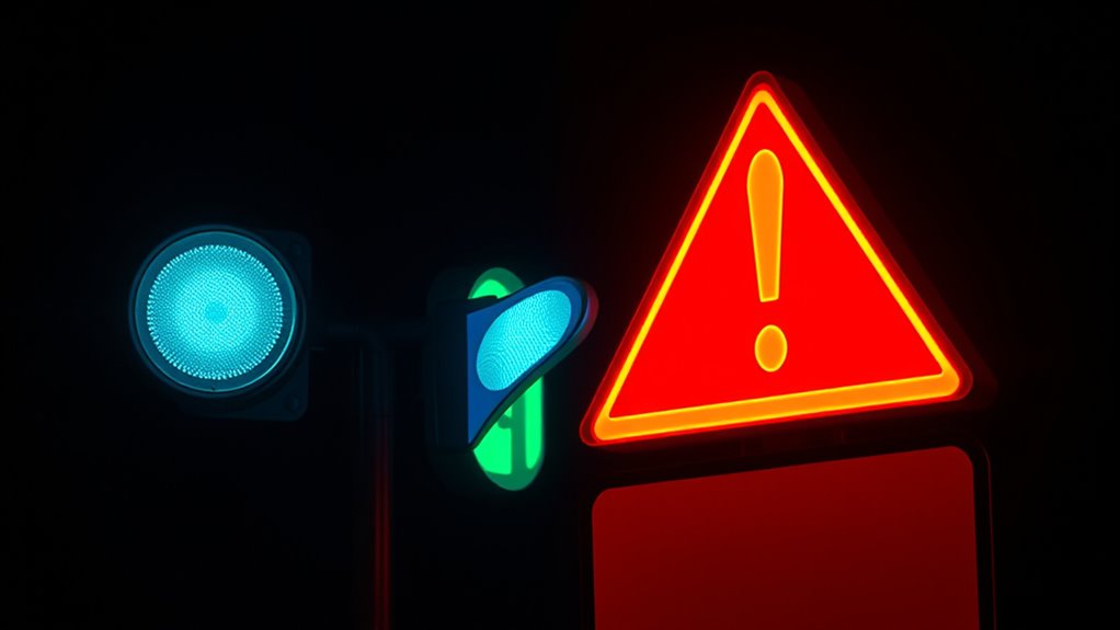
Blue and green tend to attract less immediate attention in visual alerts, especially compared to more vibrant or contrasting colors. This is because their psychological effects often promote calmness and stability, influencing your perception of urgency. When it comes to color perception, these hues are less likely to trigger a rapid response because they are associated with tranquility rather than alertness. Additionally, anti-aging effects associated with eye patches can create a perception of health and vitality, which may subtly influence how viewers interpret visual cues. They evoke a sense of safety or reassurance, reducing perceived urgency. Their lower contrast with backgrounds can diminish visibility in high-stakes environments. Their psychological effects can cause your brain to interpret them as less critical signals.
Blue and green are less attention-grabbing because they evoke calmness rather than urgency.
Understanding these factors helps you recognize why blue and green are less effective for grabbing attention quickly in urgent situations.
Cultural Associations and Perceptions of Color in Alerts

Cultural meanings deeply influence how you perceive the effectiveness of colors in alerts. Your background shapes the cultural symbolism you associate with specific hues, affecting your response. For example, red often signals danger in Western cultures but symbolizes luck in China. These perception biases can alter how quickly you notice alerts. Recognizing these differences helps you design more effective signals globally. Here’s a quick overview:
| Color | Cultural Symbolism | Perception Biases |
|---|---|---|
| Red | Danger, urgency, celebration | Faster detection due to high-stakes meaning |
| Yellow | Caution, optimism | Increased attention in warning contexts |
| Green | Safety, nature | Lower alert perception, sometimes calming |
Tailoring colors to cultural contexts minimizes misinterpretation and enhances alert effectiveness. Additionally, understanding visual perception principles can improve how alert signals are processed across diverse audiences.
The Science Behind Color Contrast and Visibility

Understanding how colors contrast and stand out is essential for designing effective visual alerts. High contrast improves visibility and leverages principles of visual perception, making alerts easier to notice quickly. Color psychology plays a role, as certain hues amplify alertness, especially when contrasted sharply. To optimize visibility, consider these factors:
- Use complementary colors to maximize contrast and draw attention rapidly.
- Enhance luminance differences between foreground and background for clearer perception.
- Avoid color combinations that blend or cause visual strain, ensuring alerts remain salient.
- Incorporating dog names that evoke specific emotions can also influence the effectiveness of visual alerts.
Designing Alerts: Combining Color With Shape and Size
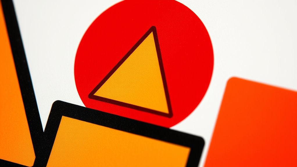
You can enhance alert effectiveness by combining colors with distinct shapes and sizes to convey urgency and importance. The synergy between color and shape influences how quickly and clearly your message is understood, especially when size boosts visibility. Paying attention to contrast helps you signal the alert’s priority, ensuring users respond promptly. Incorporating visual organization principles can further improve clarity and reduce confusion during critical moments.
Color-Shape Synergy Effects
Combining color with shape and size can considerably enhance the effectiveness of visual alerts by creating stronger psychological impressions. This is known as color shape synergy, which leverages visual perception to direct attention quickly. When you pair vibrant colors with distinct shapes, you reinforce message clarity and urgency. For example, a red octagon signals danger, while a yellow triangle indicates caution, making these alerts instantly recognizable.
- Bright, contrasting colors paired with simple geometric shapes amplify recognition.
- Specific shapes evoke emotional responses, such as circles for safety or triangles for warning.
- Consistent use of color-shape combinations builds intuitive associations, speeding up perception.
Mastering color shape synergy improves alert visibility, ensuring your message cuts through distractions effectively.
Size and Visibility Impact
Size plays a crucial role in how quickly and effectively visual alerts capture attention, especially when paired with strategic use of color and shape. Perceived size influences how your audience interprets the importance of an alert within the visual hierarchy. Larger elements naturally stand out, guiding viewers’ focus toward critical messages first. By adjusting the size of your alert components, you create a clear visual priority, making vital information more noticeable. When combined with bold colors or contrasting shapes, size enhances visibility and speeds up recognition. Keep in mind that overly large elements can dominate the entire layout, so balance is key. Proper sizing ensures your alert commands attention without overwhelming the overall design, making your message both immediate and impactful. Additionally, incorporating aesthetic wall organization principles can subtly reinforce the importance of the alert through visual harmony and strategic placement.
Contrast for Urgency
Contrast is essential for conveying urgency in visual alerts, as it makes key elements stand out immediately. High contrast captures attention quickly, triggering strong psychological effects that prompt swift reactions. Understanding color symbolism helps you select the right combinations; for example, red often signals danger and urgency, while black and white create stark visibility. To enhance this effect, consider:
- Using complementary colors to maximize visual impact
- Pairing intense colors with bold shapes for clarity
- Balancing contrast to avoid overwhelming the viewer
Common Mistakes That Reduce the Impact of Visual Cues
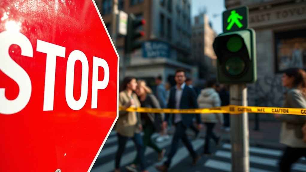
One common mistake that diminishes the effectiveness of visual cues is neglecting the importance of consistency. Using inconsistent or inappropriate contextual color can confuse viewers and weaken their emotional response. For example, assigning different colors for similar alerts reduces recognition and hampers quick understanding. Additionally, ignoring the emotional response that colors evoke can lead to ineffective communication; a color that doesn’t align with the message or context may fail to grab attention or trigger the desired reaction. You should guarantee that your visual cues use standardized colors appropriate for the situation, reinforcing clarity and urgency. Consistency in color usage helps viewers develop associations, making your alerts more intuitive and impactful. Avoid mixing colors or meanings, and always consider the emotional response you want to evoke.
Future Trends in Color Psychology for Emergency Signage

Emerging color technologies are transforming how emergency signs grab attention and convey urgency. Adaptive signage systems can adjust colors based on environmental conditions or cultural contexts, making alerts more effective. As these trends evolve, understanding cultural color variations will be key to designing universally impactful visual cues.
Emerging Color Technologies
Advancements in color technology are paving the way for more effective emergency signage, with future trends focusing on increasing visibility and intuitive recognition. These innovations aim to enhance sensory perception by leveraging new materials and methods that respond dynamically to environmental conditions. You can expect signs that adapt their color intensity or hue based on lighting or surrounding activity, improving immediate recognition. Emerging technologies include:
- Electroluminescent and OLED displays that emit bright, consistent signals regardless of ambient light
- Color-changing materials that respond to temperature or moisture, alerting viewers in real-time
- Infrared and UV-responsive inks that remain invisible until activated, reducing visual clutter while maintaining high visibility in emergencies
These advancements harness insights from color psychology, making signs more instinctive and impactful during critical moments.
Adaptive Signage Systems
Harnessing the power of adaptive signage systems, future emergency signs will dynamically adjust their colors and intensity to optimize visibility in real time. By leveraging adaptive technology, these signs respond to environmental conditions like lighting, weather, or crowd density, ensuring they grab attention when needed most. Color psychology plays a central role, as signs can shift to more effective hues—such as bright reds or fluorescents—based on context, enhancing recognition and response. This real-time adaptability reduces confusion during emergencies, guiding people swiftly to safety. You’ll benefit from signs that intelligently react to their surroundings, making emergency communication more effective and intuitive. As technology advances, these systems will become standard, transforming how we perceive and respond to urgent visual alerts.
Cultural Color Variations
As societies become increasingly multicultural, understanding cultural variations in color perception is essential for designing effective emergency signage. Cultural symbolism influences how colors are interpreted across regions, affecting their ability to grab attention or convey urgency. Recognizing regional preferences helps guarantee signs resonate appropriately and avoid miscommunication. For example, red might symbolize danger in Western cultures but represent good luck in China. To adapt effectively, consider these factors:
- The impact of cultural symbolism on color associations
- Regional preferences that influence color choices
- How familiarity with local color meanings enhances sign effectiveness
Frequently Asked Questions
How Do Individual Differences Affect Color Perception in Alerts?
Individual differences shape how you perceive colors in alerts through cultural associations and personal experiences. For example, a red alert might signal danger for you due to your cultural background, while someone else may see it as a warning or even excitement. Your unique experiences influence which colors catch your eye and trigger a response, making it essential to contemplate diverse perceptions when designing effective alerts.
Can Color-Blind Individuals Distinguish Between Common Warning Colors?
You might wonder if color-blind individuals can distinguish warning colors. Due to differences in contrast sensitivity and color contrast perception, many struggle with certain hues, especially reds and greens. However, high contrast between warning signals and backgrounds can help them identify alerts more easily. Using distinct shapes and textures alongside color cues ensures essential information remains accessible, regardless of color perception limitations.
How Does Ambient Lighting Impact the Effectiveness of Color-Based Alerts?
Ambient light markedly influences alert visibility by affecting how colors appear. In bright environments, colors may become less noticeable, making it harder for you to detect alerts quickly. Conversely, dim lighting can enhance contrast, improving alert visibility. You should consider adjusting lighting conditions or using high-contrast colors to guarantee alerts stand out effectively in various ambient light scenarios, keeping you informed and safe at all times.
Are There Specific Color Combinations That Enhance Alert Visibility?
You should consider that specific color combinations enhance alert visibility through contrast sensitivity and color contrast. Bright, high-contrast pairs like red and white or yellow and black grab attention quickly because they stand out against backgrounds and are easily distinguishable. By using these combinations, you make your alerts more effective, ensuring they catch the eye immediately and communicate urgency without confusion or delay.
How Do Recent Technological Advances Influence the Use of Color in Alerts?
Recent technological advances, like improved display technology and precise color calibration, markedly influence how you use color in alerts. With better display technology, you can guarantee colors appear consistent across devices, making alerts more effective. Color calibration helps you select the most attention-grabbing hues, enhancing visibility and quick response. These innovations let you optimize alert design, ensuring your messages stand out clearly and reliably in any environment.
Conclusion
Remember, the right colors are your first responders in capturing attention. Like a lighthouse cutting through fog, strategic hues guide the eye swiftly and safely. By understanding color psychology, you wield the power to make warnings unmissable—saving lives and preventing chaos. So, choose your palette wisely; let your alerts shine brightly, cutting through the noise with a vibrant voice that commands notice and commands respect.

